Seasonal color palettes take center stage in the design and fashion world, influencing trends and consumer choices. Get ready to dive into a vibrant palette of hues that define style and creativity.
Importance of Seasonal Color Palettes
Seasonal color palettes play a crucial role in design and fashion by reflecting current trends, moods, and themes. Designers and brands carefully select colors that resonate with the season to evoke specific emotions and aesthetics in their creations. These palettes not only influence the overall look of products but also impact consumer preferences and purchasing decisions.
Influence on Consumer Preferences
Seasonal color palettes have a direct influence on consumer preferences as individuals are often drawn to colors that align with the current season. For example, warm and vibrant hues like reds and oranges are popular during the fall season, while pastel shades are favored in the spring. By incorporating these colors into their products, brands can attract and resonate with their target audience, ultimately driving sales and brand loyalty.
Impact on Branding and Marketing Strategies
The use of seasonal color palettes is a powerful branding and marketing tool that helps companies distinguish themselves in the market. By consistently utilizing specific colors associated with each season, brands can create a cohesive and recognizable visual identity. This not only strengthens brand recall but also allows companies to stay relevant and fresh in the eyes of consumers. Additionally, incorporating seasonal colors in marketing campaigns can help grab attention, evoke emotions, and create a sense of urgency among customers.
Creating Seasonal Color Palettes

When it comes to creating seasonal color palettes, the process involves carefully selecting a range of colors that capture the essence of a particular season. This can be influenced by various factors such as nature, fashion trends, and cultural influences.
Selecting Colors for a Seasonal Color Palette
To start creating a seasonal color palette, it’s essential to consider the colors commonly associated with the specific season you are focusing on. For example, warm tones like reds, oranges, and yellows are often linked to fall, while pastel shades like soft blues and pinks are reminiscent of spring. Additionally, you can draw inspiration from nature, such as the changing leaves in autumn or blooming flowers in spring.
When selecting colors, aim for a mix of shades that complement each other and create a cohesive look. A good tip is to choose a dominant color as the base and then add in accent colors to provide depth and interest. Experiment with different combinations until you find a palette that evokes the feeling of the season you are designing for.
Tips for Combining Colors Effectively
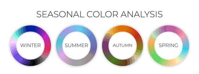
– Use a color wheel to help you choose colors that harmonize well together. Complementary colors, analogous colors, or triadic color schemes can all work effectively for a seasonal palette.
– Consider the mood you want to convey with your palette. Bright, vibrant colors can create a lively and energetic feel, while muted tones can evoke a sense of calm and tranquility.
– Pay attention to the balance of warm and cool colors in your palette. Mixing both types of shades can create a dynamic and visually appealing composition.
– Don’t be afraid to experiment with different shades and hues. Sometimes unexpected color combinations can result in a unique and eye-catching palette.
Significance of Color Psychology in Seasonal Color Palettes
Color psychology plays a crucial role in creating seasonal color palettes as different colors can evoke specific emotions and associations. For example, warm colors like red and orange can create a sense of warmth and excitement, perfect for a summer palette. On the other hand, cool colors like blues and greens can induce a feeling of calm and serenity, ideal for a winter-inspired palette.
By understanding the psychological effects of colors, you can strategically choose shades that resonate with the mood and theme of the season you are designing for. This can help create a more cohesive and impactful color palette that effectively captures the essence of the season.
Trending Seasonal Color Palettes

In the world of fashion and design, seasonal color palettes play a crucial role in determining the trends that will dominate each season. Let’s take a closer look at the current popular color schemes for different seasons and how these trends evolve over time, influenced by cultural events and societal shifts.
Spring Color Palette Trends
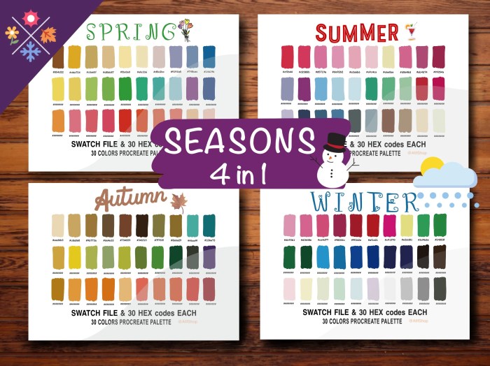
Spring is often associated with pastel shades and vibrant hues that symbolize renewal and growth. In recent years, popular colors for spring include soft greens, blush pinks, and sunny yellows. These shades evoke a sense of freshness and optimism, perfect for the season of new beginnings.
Summer Color Palette Trends
When it comes to summer, bright and bold colors take center stage. Trending summer color palettes often feature hues like tropical coral, aqua blue, and sunny orange. These colors reflect the energy and warmth of the summer months, making them popular choices for fashion and decor.
Fall Color Palette Trends
As the weather cools down, fall brings a shift towards rich and earthy tones. Popular colors for fall include deep burgundy, mustard yellow, and olive green. These hues capture the cozy and comforting atmosphere of the season, making them a staple in fall fashion and interior design.
Winter Color Palette Trends
Winter is all about embracing the cold with cool and icy tones. Trending winter color palettes often feature shades like frosty blues, silver gray, and snowy white. These colors evoke a sense of tranquility and elegance, reflecting the beauty of winter landscapes.
Each season brings its own unique color trends, influenced by a variety of factors such as cultural events, global movements, and societal shifts. By staying attuned to these evolving color palettes, designers and creatives can stay ahead of the curve and create fresh, relevant designs that resonate with audiences worldwide.
Applying Seasonal Color Palettes
Seasonal color palettes play a crucial role in various design fields, including interior design, fashion design, and digital/graphic design. Let’s explore how these color schemes are applied in different contexts.
Interior Design
In interior design, seasonal color palettes are used to create a harmonious and cohesive look for a space. Designers carefully select colors that reflect the mood and aesthetic of a particular season. For example, warm and cozy tones like deep reds and oranges are often used in the fall, while light and airy pastels are popular choices for spring.
Fashion Design
Fashion designers draw inspiration from seasonal color palettes to create collections that are on-trend and relevant. They incorporate shades that are associated with a specific season to evoke a certain feeling or vibe. For instance, bright and vibrant colors are common in summer collections, while rich jewel tones are favored in winter lines.
Digital and Graphic Design, Seasonal color palettes
Seasonal color palettes are essential in digital and graphic design to convey a brand’s message or evoke a specific emotion. Designers use colors that are in line with the current season to create visually appealing websites, social media graphics, and marketing materials. For example, a beach-themed campaign may feature bright blues and sunny yellows for a summer aesthetic.